Jazz North Announces Major Relaunch


New Website, New Branding and Relaunch of Key Programmes
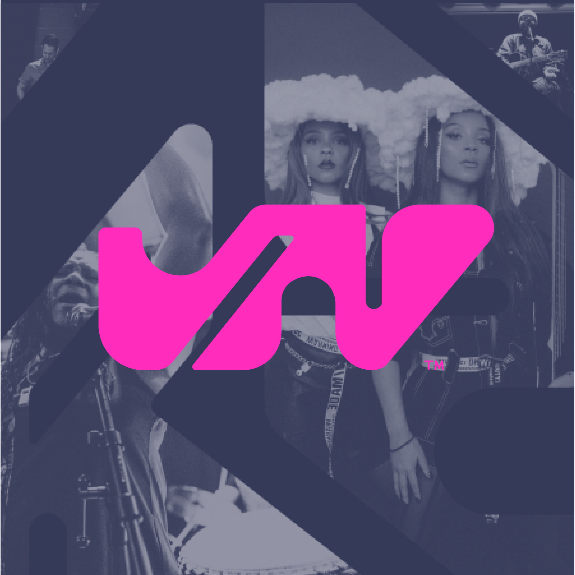
On Tuesday 31st October, Jazz North will launch its new website alongside a major new rebrand.
The site will provide clarity and reduce barriers to access. Most importantly, it will present the sector with the Jazz North offer for the coming years.
Opportunity
Opportunity forms the centre of all that Jazz North delivers and includes artist and promoter support in the shape of New Northern and the flagship Northern Line development programme.
Community
Jazz North continues to support the northern community through regular online Forums and skills development via digital Workshops, alongside in-person Artist Development Days.
Resources
Jazz North provides a host of sector resources, ranging from funding advice to Certificates of Sponsorship for the promotion of overseas artists.
Learning & Participation
Through programmes such as the Playlist Project and the award-winning Jazz Camp for Girls, Jazz North looks to inspire the next generation with the creativity and empowerment inherent to Jazz.
“The new Jazz North design is a reflection of our northern Jazz community - Bold, fluid and creative - A celebration of the very best side of weird.
“We wanted to use this moment as a reiteration of our mission and celebrate our programmes of Opportunity, Community, Learning & Participation.
“At Jazz North we are committed to the development of Community Through Sound”
Chris Bye, CEO of Jazz North.


About the design process
Designer Oli Bentley of Split led the creative team behind our new branding.
Oli says:
From conversations with a range of members of the local jazz community, we had some great discussions about how the brand should feel.
Following Jazz North’s brief to subvert the visual expectations of a ‘jazz' brand, we wanted to create a visual identity that felt contemporary, bold, unexpected, creative, fluid, spontaneous — and the very best side of weird! As Wayne Shorter put it, “To me Jazz means: I dare you”.
Among all the conversations we had, this statement stuck out for me:
“Jazz North is like the glue that helps hold us all together”
— Workshop Participant
The idea of ‘glue' sparked a really interesting starting point for me typographically. From this, a set of viscous letterforms emerged. The final letters can be used to spell Jazz North, as well as other titles, and each form plays with the structure of a letter, in the same way that — as musicians — we play with the structure of a well known standard. Just like our community members, each one has a completely individual character, but also a shared attitude — and when they come together, they do so in interesting, creative ways.